Improving signup experience for a digital health service
Designing landing page and survey assessment to help women better manage menopause
Background
Many women struggle to understand and adapt to the changes of their bodies during midlife. The founder of Lisa Health wanted to design a mobile first digital health platform to help women understand their menopause symptoms and help them reduce symptoms through wellness plans.
I and another design consultant worked together on bringing this vision to life during a span of 4 months from Jan to April 2017. I focused on the landing page and signup experience while the other designer focused on the post-signup experience and wellness plans.
The web application has since been launched and was featured in an WSJ article discussing technology and women's health.
How might we design the landing page so that users would take the menopause assessment and signup for digital wellness plans?
Research
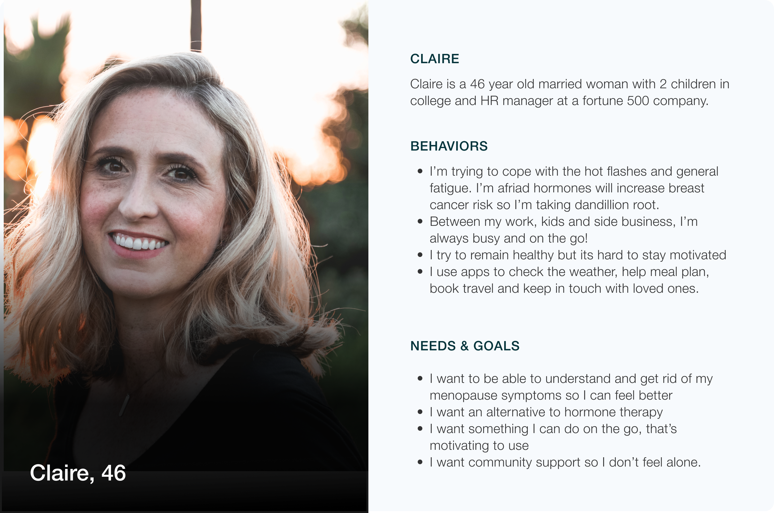
Lisa Health had already conducted prior user research and interviews. We used these findings to generate a user persona and user journey map to better empathize with the target user and guide product design decisions.
Challenges
Menopause is a sensitive, confusing topic for women
Menopause is an emotionally charged, personal topic for many women about their bodies and ageing. Additionally, many women were not previously educated about menopause and didn't understand their symptoms. Women usually googled help for symptoms or reached out to trusted girlfriends of family for resources and advice. However, it was difficult for women to find authoritative information from a supportive source. As one user puts it, "When you're young you learn about periods and puberty. There is a lack of info on women's health when you get older.”
Different user motivations
Users had different needs and motivations for coming to Lisa. Women already experiencing menopause, for example, wanted to learn more about symptoms and how to manage them. Other women were looking for more support and community. Younger women wanted to know their risk of early menopause.
Data privacy concerns
Women also had data privacy concerns when answering questions related to their personal health and menopause symptoms and concerned about how their information was going to be used.
Information overload
Lastly, the information available about menopause on the internet and in academic literature could be overwhelming. Women wanted an easy way to understand what menopause was and their menopause symptoms.
Solutions
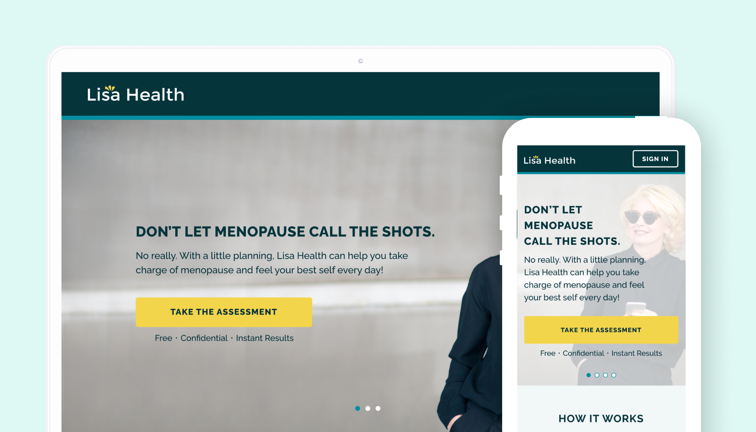
Reframing menopause in terms of positive growth
Menopause is often associated with aging and loss and we wanted to reframe it positively rather than negatively. As one user puts it "Women's health should feel really personal, empowering and not "flowers and daisies". Aging should not feel like the end-all but as something to be leveraged for life success."
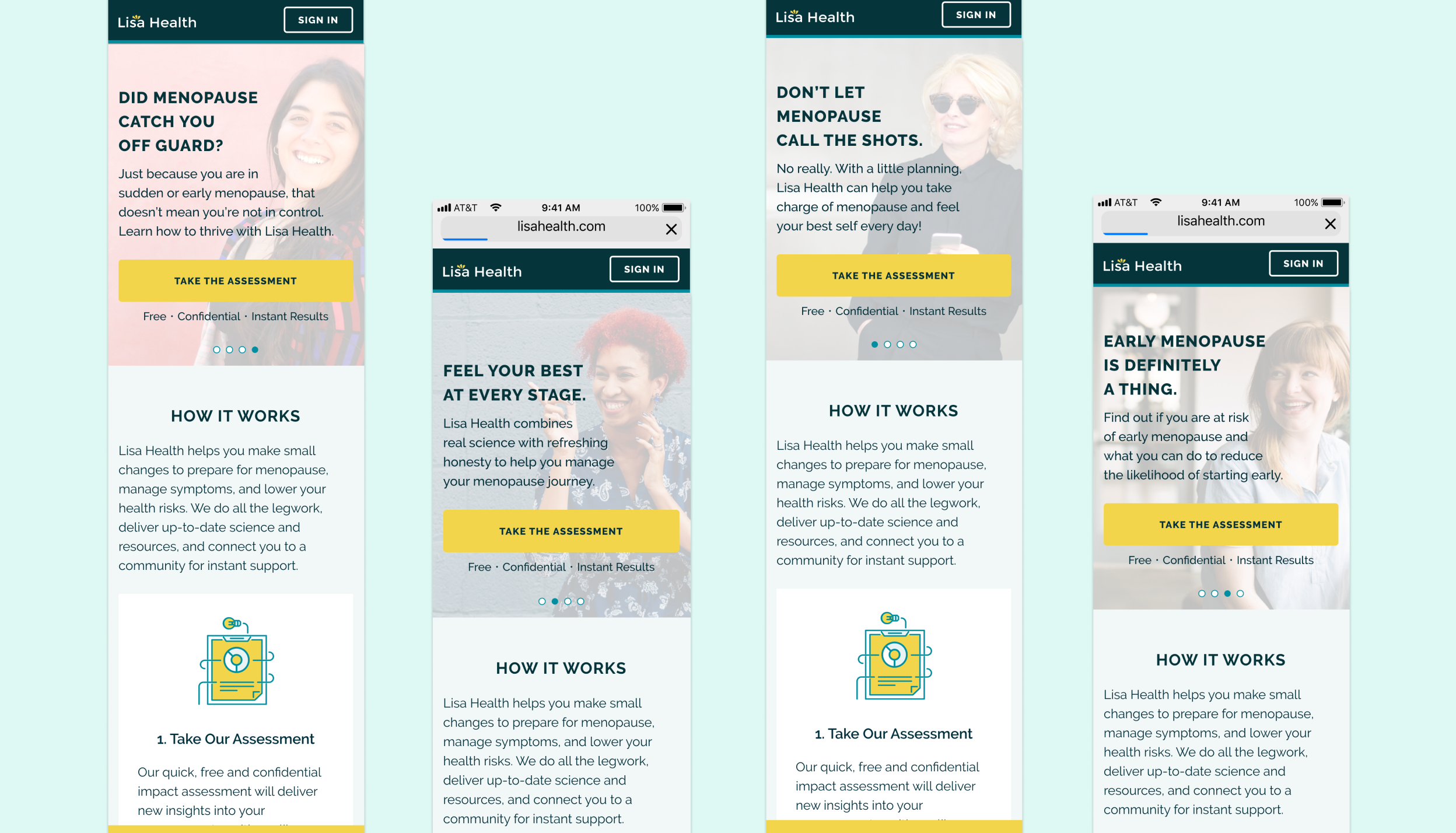
Designing for multiple personas
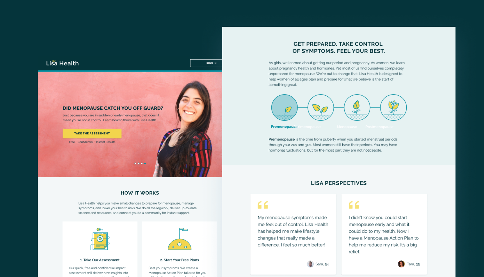
Since many women were on different stages of their menopause journey and had different needs, an automatic carousel was used to display different images and value propositions that spoke to women at different stages.
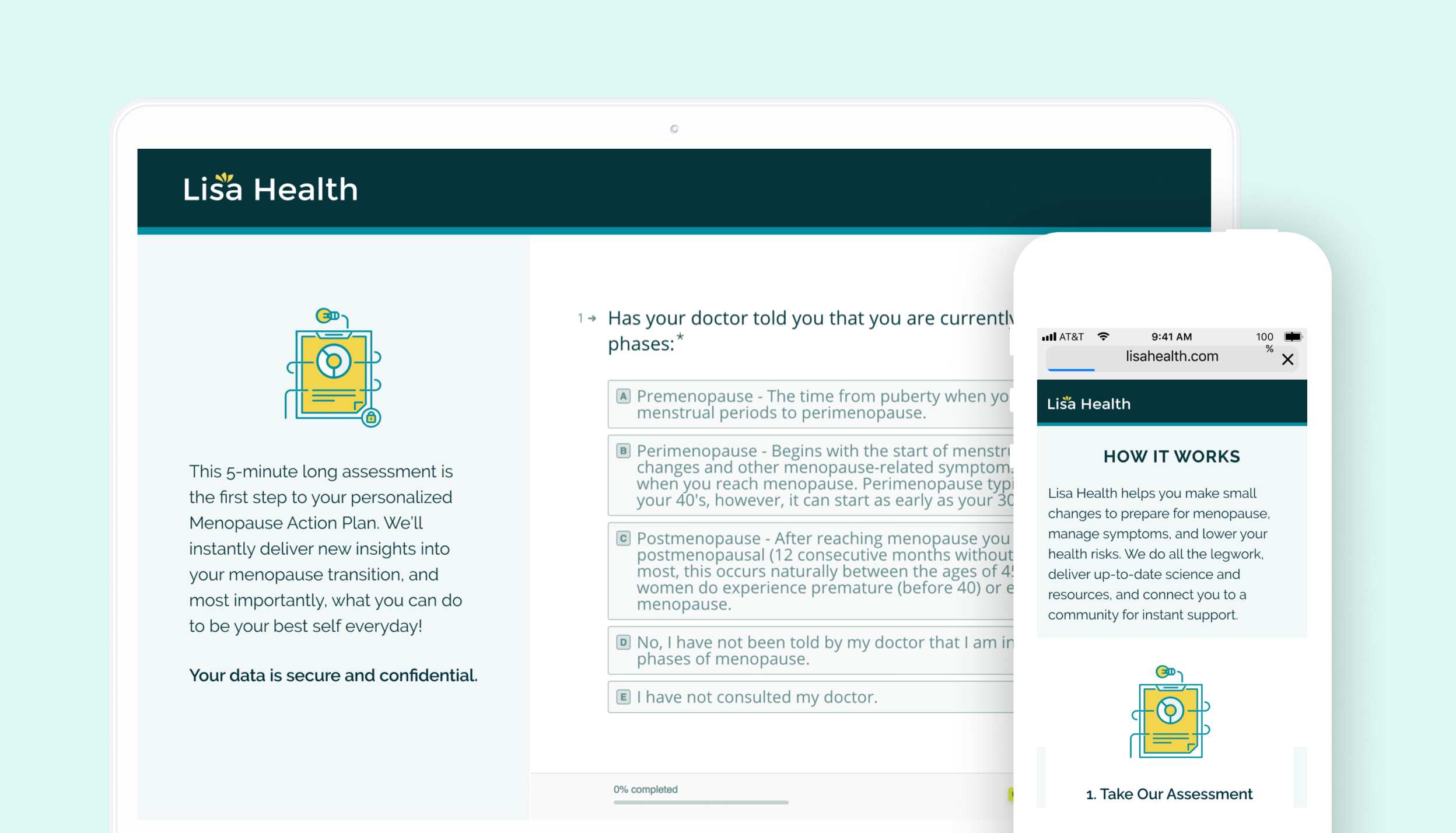
Confidential menopause assessment
A key insight from the user research was that women wanted actionable information about how to manage their symptoms. We designed the assessment to help them understand their symptoms better and start to manage their symptoms. We addressed data privacy concerns as well by indicating that responses were confidential and secure.
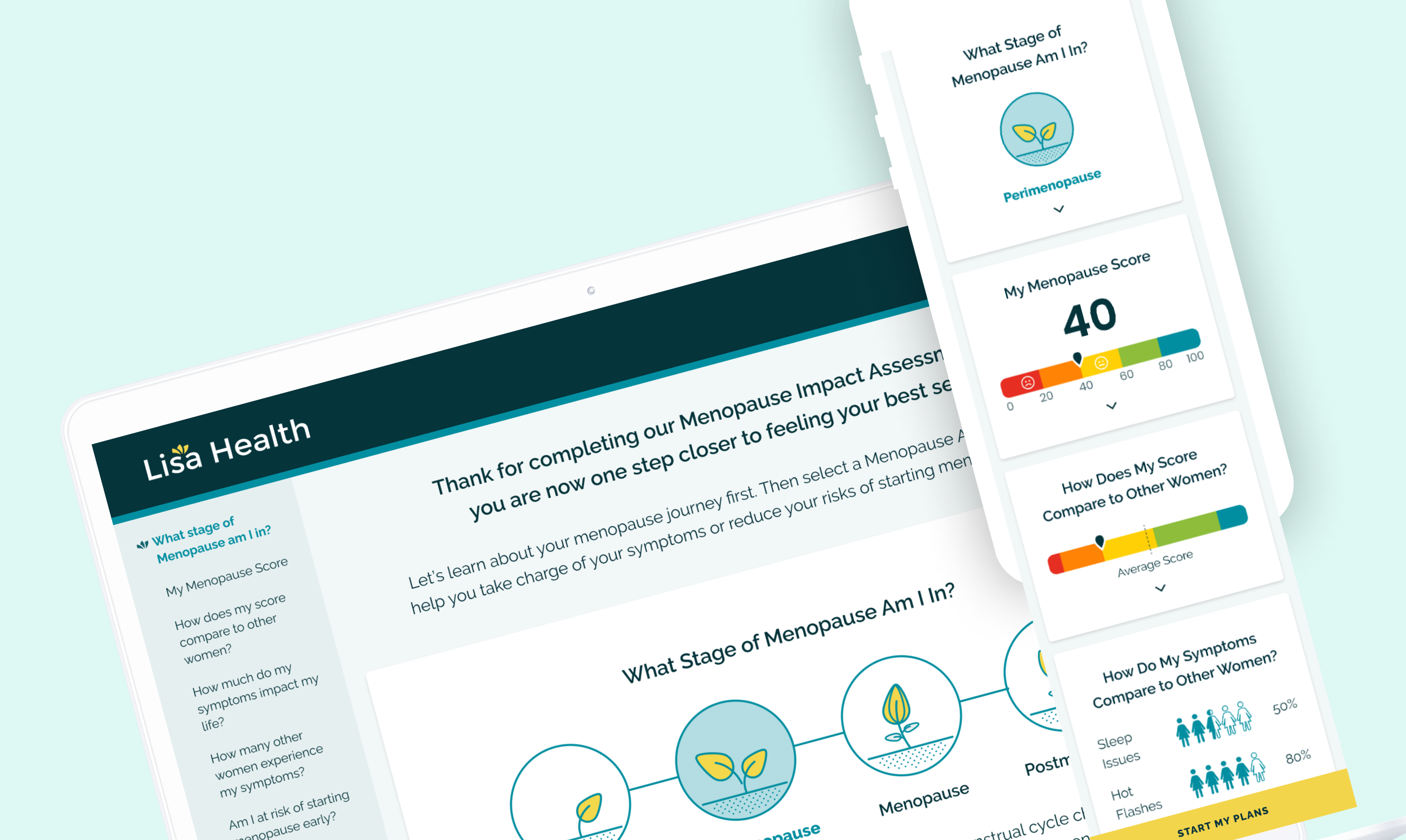
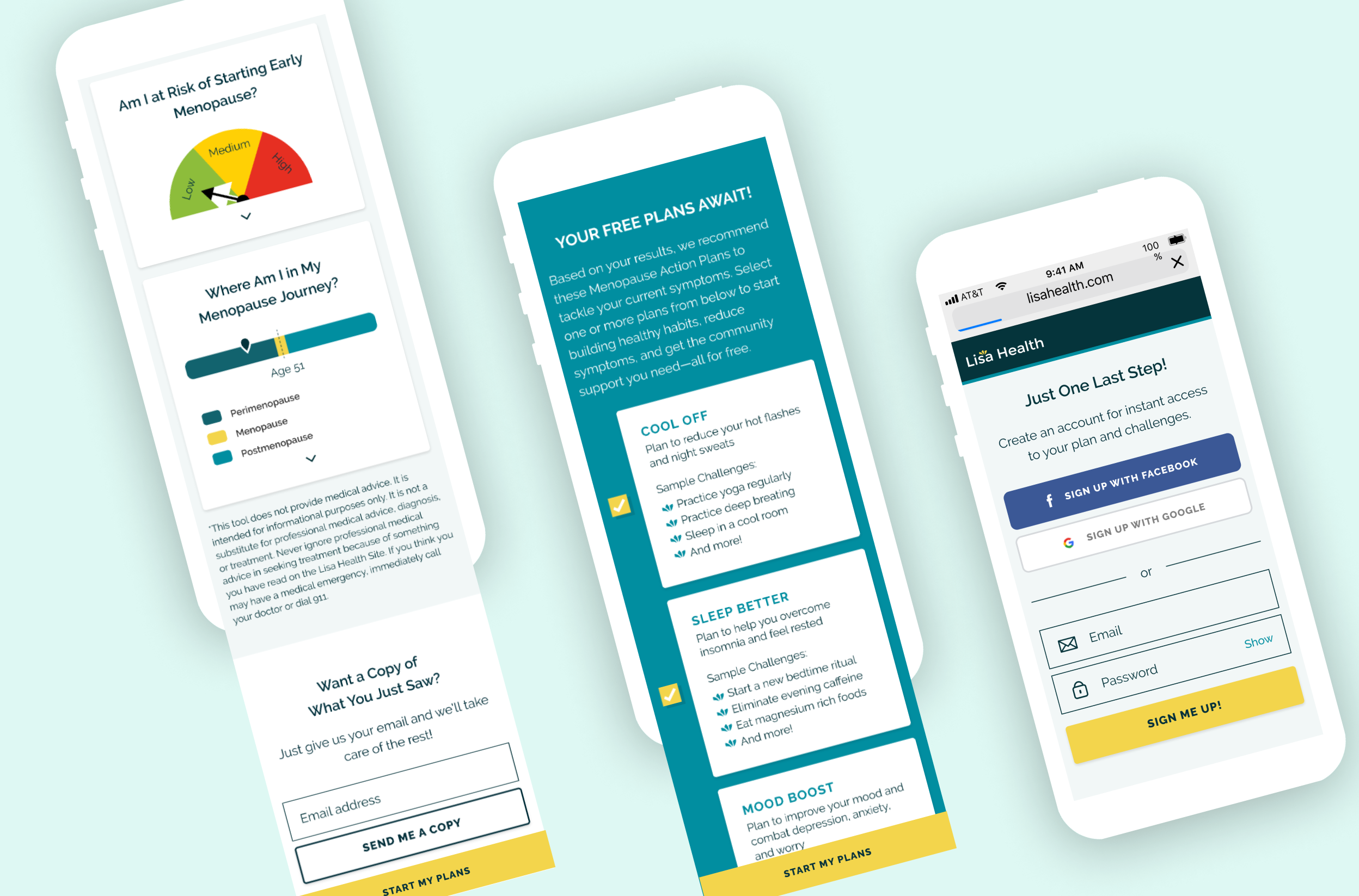
Informative visualisations
A key insight from the user research was that women wanted actionable information but did not want to be overwhelmed. We designed the assessment results to help them understand their symptoms better and start to manage their symptoms through the use of engaging, simple visualizations. Additionally, it served as an incentive to allow users to signup for the platform.
Results
We evaluated our landing page and survey designs with targeted users. 86% of participants were convinced to take the free assessment while 22% of participants would sign up.
The web application has since been launched in 2018 and was featured in an WSJ article discussing technology and women's health.